
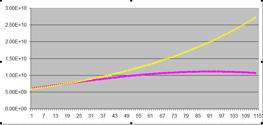
The yellow curve represents the case of exponential growth at a constant rate (in this case 1.35% per year which was the growth rate in the year 2000).
The Pink curve represents the case of exponential growth at a rate that declines at .05% per year which is the likely trajectory of human population growth. Mathematically, this eventually leads to negative population growth - but the point remains - the pink curve is still defined by exponential functions!
2) how to calculate an exponential doubling time ( Derivation here )
3) how to determine exponential growth from the data themselves: Its pretty simple. Take the natural log of the ratio of the final population to the initial population and divide that by the number of years between the initial and final populations.
Example: